‘Wow, so pretty!’ Haven’t we all lost count of the times we exclaimed with awe whenever we saw the ‘home’ interiors in ‘Bridgerton’ or ‘Crown.’ The textures, the luxury, the opulence—something that wouldn’t easily fit in our small spaces and budgets. Or so we think.
With design being a matter of personal taste, one would think there couldn’t possibly be hard and fast cardinal rules about decking up a space, and yet, there are…plenty of them at that. Muted walls, white ceilings, scaled furniture, and unadorned surfaces will allude to a space more extensive than it actually is, or so has been told umpteenth times to all small apartment owners.
Not to forget the ever-changing ‘trends’ like Minimalism, Bohemian, Scandinavian, Oriental, etc., that change things up to make them ‘not-boring’, but make tackling space crunches even harder. Don’t mind us, and feel free to follow these tentpoles of modern design if that’s what you like.
But read on if you believe your space should reflect your personality and feel like home instead of feeling like a sanitized space of fleeting trends. So, what are some of the sticky rules that you should break to live with style within your compact apartment? Here we go!
Rule #1: Furniture Scaled to Room Size
A super-popular but super-stodgy rule of decorating small spaces involves fitting in furniture optimized for your room size. Sure, they give an illusion of a bigger space. However, that’s all that they do –as non-offending pieces of furniture that dissolve in the background.
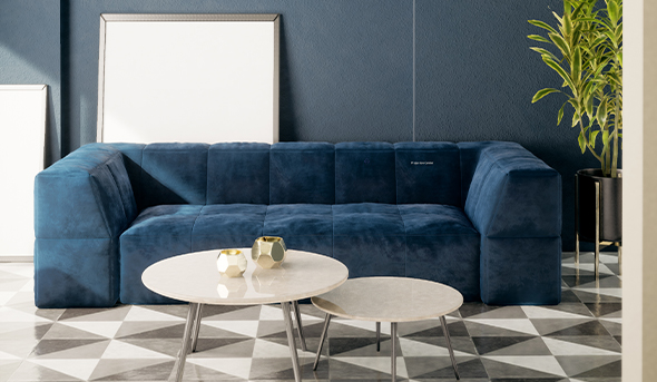
Instead, why not have a single piece of stand-out furniture to make your iconic Friends couch? And no, it doesn’t have to be orange. Or does it? No, of course not. It should serve as the anchor for your room. (Are your walls Lilac?)
Oh, and while you are at it, make sure it is modular and has lots and lots and lots of storage. Furniture needs to be multifunctional, eh?
Rule #2: Muted Walls
A trick older than scaled furniture is the use of monotones for painting walls. Yes, we understand these shades reflect light and make a room airy. But white and cream are boring!
Why not make it red like Amelie’s beautiful Paris apartment, or pink like the Grand Budapest Hotel, or themed orange—no, not like Friends, like Clockwork orange, minus the craziness? Too risqué for you? Then calm yourself down and paint your wall an earthy shade. Still, want white? Then contrast it with deep-hued furniture, ‘2001: A Space Odyssey’ style.
Rule #3: Matching Dining Furniture
Matching things up sure looks like the room is pretty put together. But put together isn’t bold unless you have a knack for designing like Wes Anderson movies, where everything is symmetrical and layered.
Instead, how about adding some pizzazz by mixing things up a wee bit? Maybe having chairs in the same style but different shades? Or take things up a notch by adding a swing to the side. Your kids will love you for it, and so will the inner child in you.
Rule #4: Wall Accessories = Clutter
We disagree. Accessories = Personality. Like Peter Parker, feel free to add your Marvel toy models to your shelves. Add animal illustrations in vintage frames like the shy waitress in Amelie (Yes, we are obsessed with that movie) to get a quirky look.
Don’t be afraid of mixing traditional antiques with modern art to get a chic look. Add cushions, drapes, and rugs if you like lazing around. Remember, there is an order to chaos.
Rule #5: Prosaic Mirror Frames
Ok! Mirrors aren’t going out of fashion, ever. They make up for the small window and add a breadth of freshness to the room. But why so wry and threadbare? We aren’t looking for Oculus’s vintage mirror level of excitement. Unique frames and shades will do. Add mirrors with wacky designs to your master bedroom, bathroom, kitchen, or any other space that could use a window.
Rule #6: White Ceilings
Sigh! Aren’t you tired of white ceilings? Dark shades are often accused of shrinking the rooms, but they can also add depth if done right, like swapping a flat shade for a semi-gloss paint that reflects light. Blues, grays, and greens are great options, especially when complemented with lighter reflective pieces, such as photo frames or mirrors.
However, if dark isn’t your thing, experiment with earthy tones, as they make your room look cozy. (Anything really, as long as it isn’t sterile white!)
Rule #7: Pretty up with Lampshades
Lighting does play a pivotal role in the final look of your room, and lampshades are a pretty way to lighten up your room while maintaining symmetry. Why not change things up by opting for a houseplant instead? After all, aren’t these ubiquitous in all of the dreamy rooms shared by your favorite Instagram influencers?
Break your room’s monotony by keeping a lampshade on one side and a similarly- heightened houseplant on the other end. Else, try positioning potted plants and creepers all around your room for an airier look.
Decorate Your Dwellings to Reflect Your Style
Sure, keeping your small spaces functional while adding style and zest to your home’s interiors can be tricky, especially with everyone shouting down your throat about the next ‘In Trend.’ Do yourself a favor and curate your space per your liking and needs to build a home that feels authentic and meaningful to you. Explore Pepperfry’s catalog for items that outlive trends.


